MORPH STUDIO
FORM IN TRANSITION
BRAND DEVELOPMENT ︎ FOR DRAGONFLY COLLECTIVE
12. 2017 ︎ 01. 2020
Morph Studio is a new organization based in Memphis, TN. The team has set themseleves to a monumental task; reconsider the relationships that people have with their health.
By building products which leverage the power of research-based analytic models, Morph Studio is partnering with social care organizations, public health agencies and local communities to work toward building a “whole-person” approach to health.
By building products which leverage the power of research-based analytic models, Morph Studio is partnering with social care organizations, public health agencies and local communities to work toward building a “whole-person” approach to health.
My task was to create a brand system that would set these collosal endeavors apart from the crowd. With the name “Morph” as a guide I was able to develop a strong and flexible approach that set the team off and running.
Art Direction & Design: Jake Lerman
︎ A SYSTEM NOT A LOGO
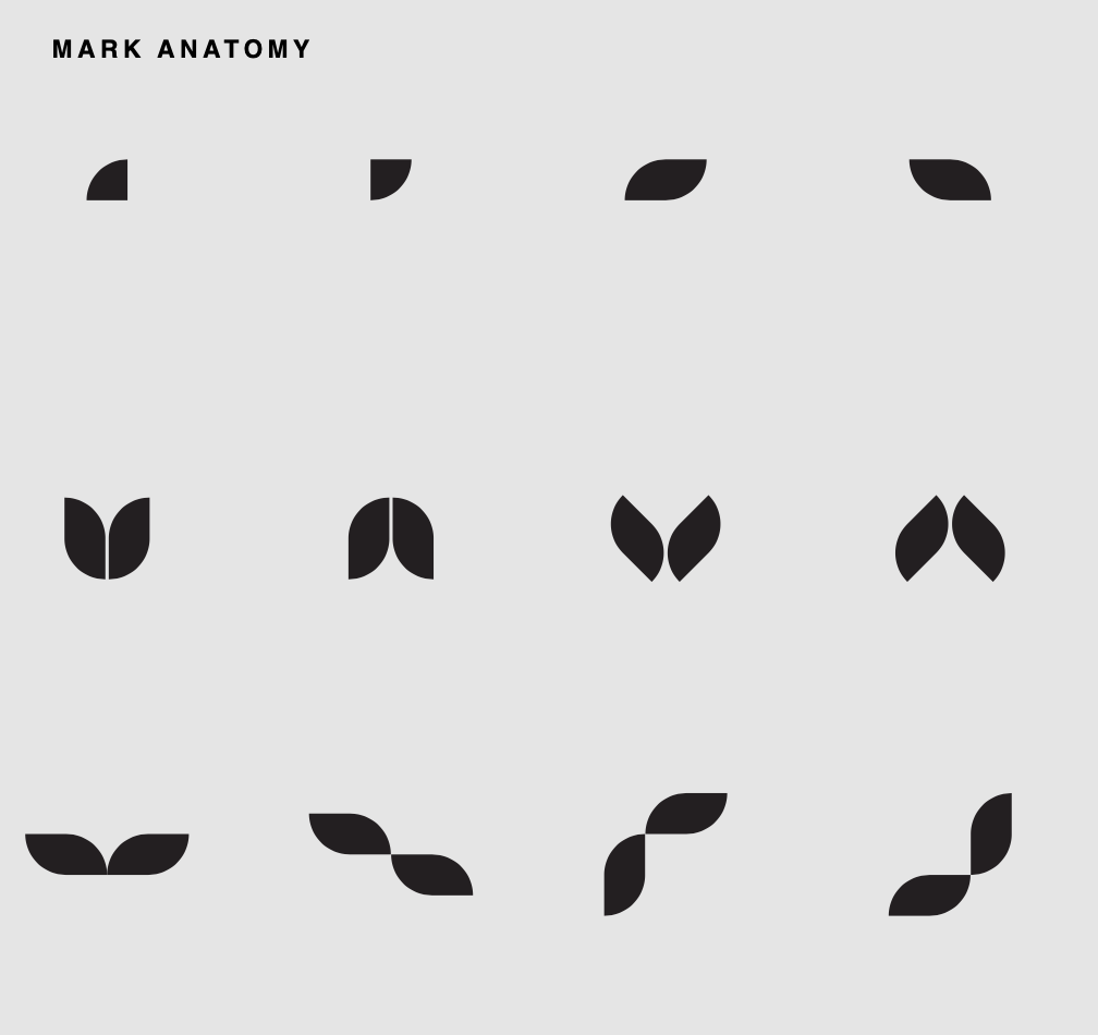
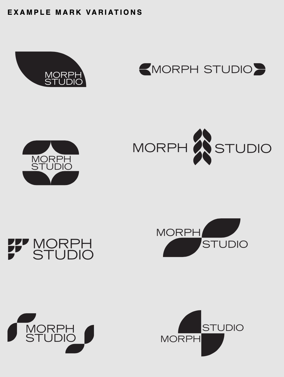
Morph activates over 500,000 datapoints to inform their analytics. This cloud of information, gathered from countless community level sources is the backbone of their impact. Creating a static logo was obviously not sufficient to represent such a broad, nimble endeavor.
In response to that challenge, I developed a colelction of “atomic” forms that can flex and evolve into various configurations to suite the evolving needs of the organization.
︎ COMING ALIVE
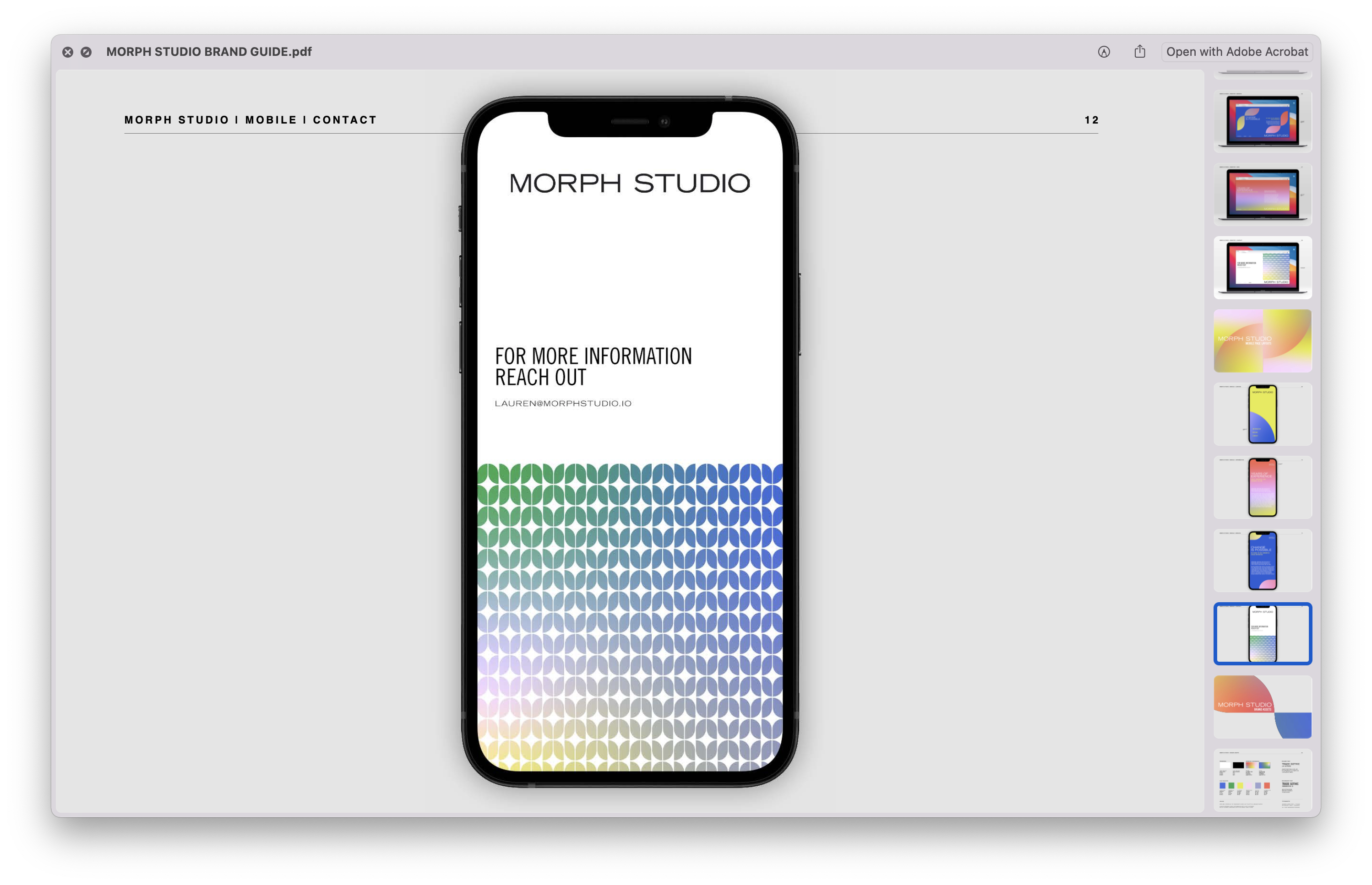
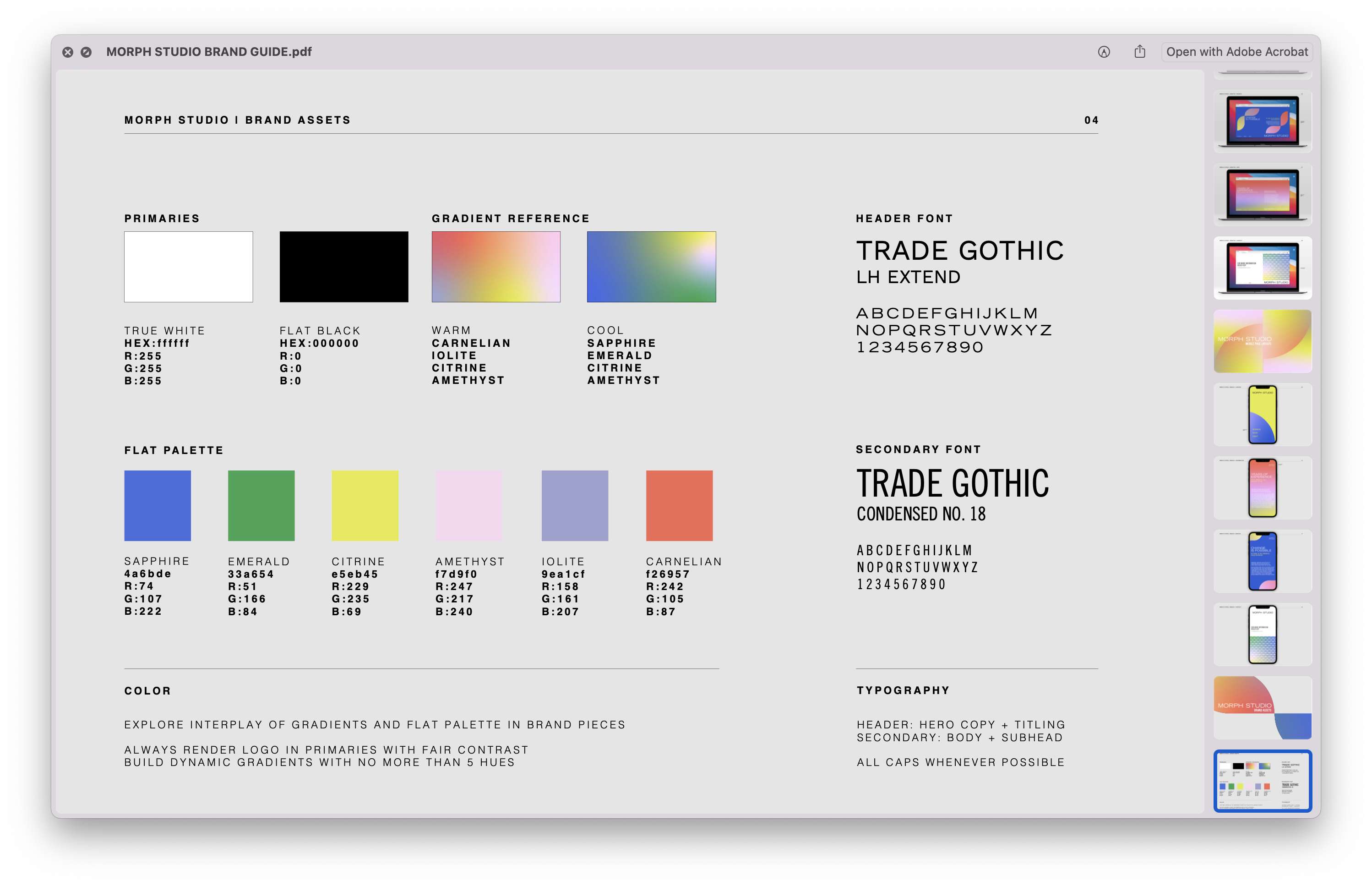
With the flexible mark as a starting point, I introduced a vibrant approach to color that is not offten associated with the analytics or healthcare arenas.
A pair of gradient swatches and a suite of jewel tones enliven the identity while the stoicism of two weights of Trade Gothic maintain the decorum needed for the important work Morph is presenting.
︎ MICRO TO MACRO
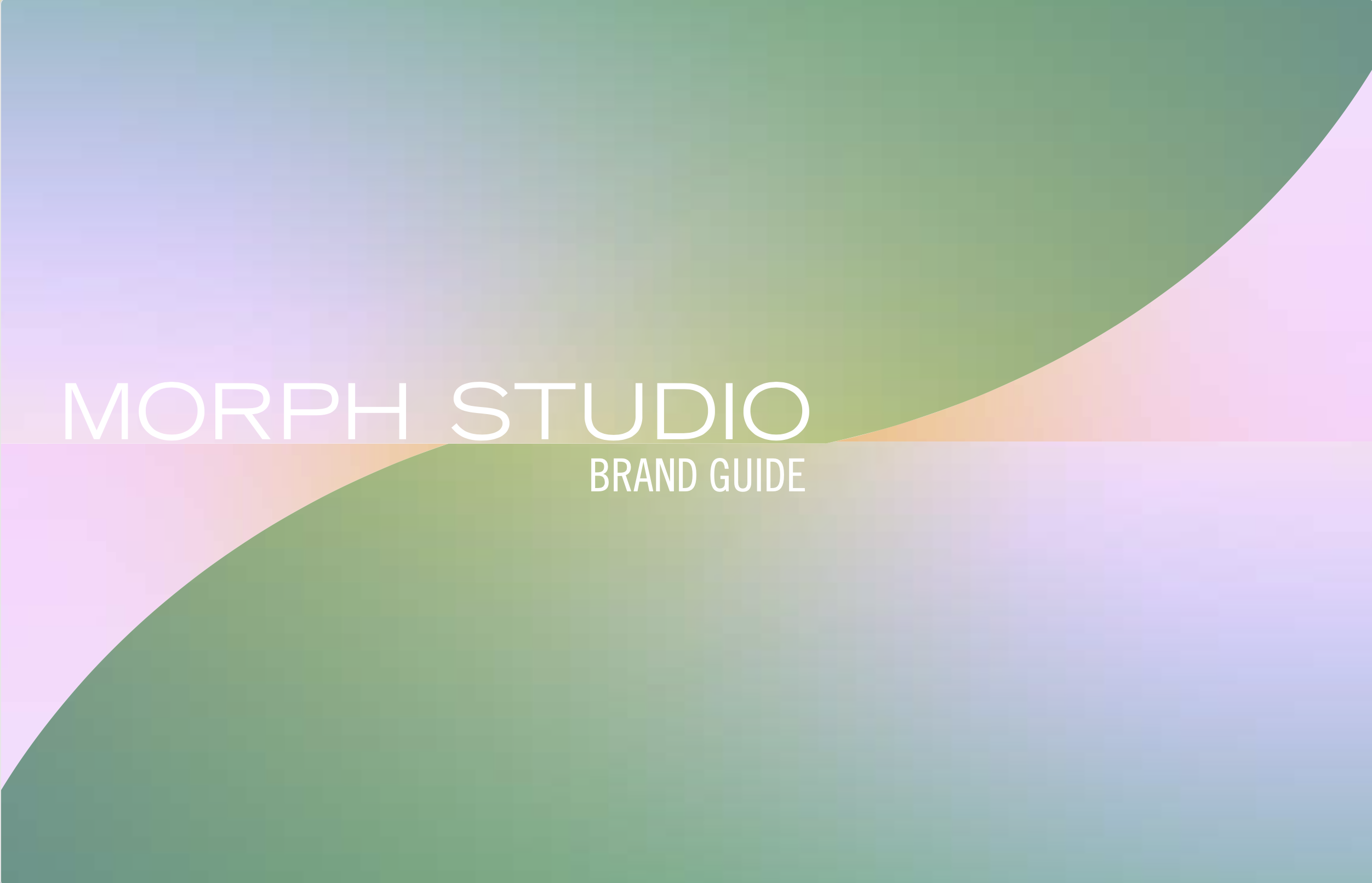
By employing local-level detail with the birds-eye power of data aggregation Morph is poised to make a sweeping and much-needed impact to our nations relationship to care.
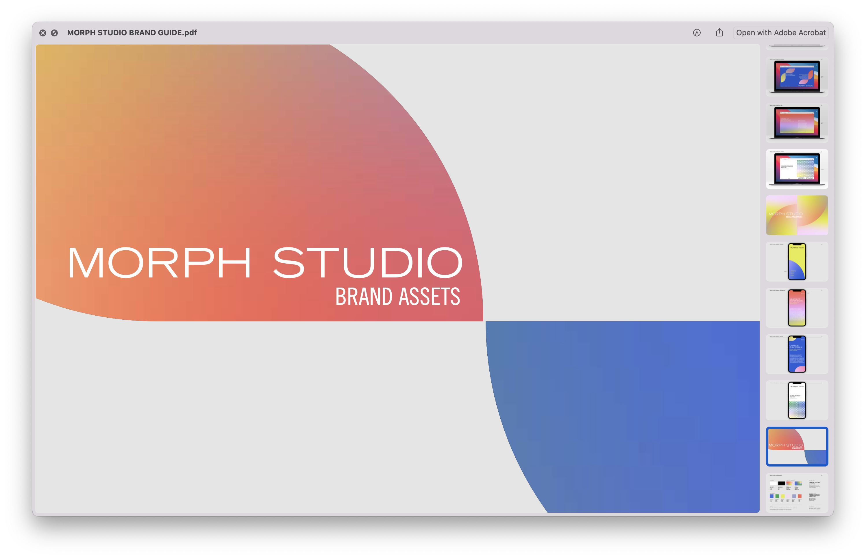
Finding a way to reference that breadth of scale and scope of Morph’s vision without losing the humanity of the project was a great challenge. These title cards are a sample of how my solution took form.