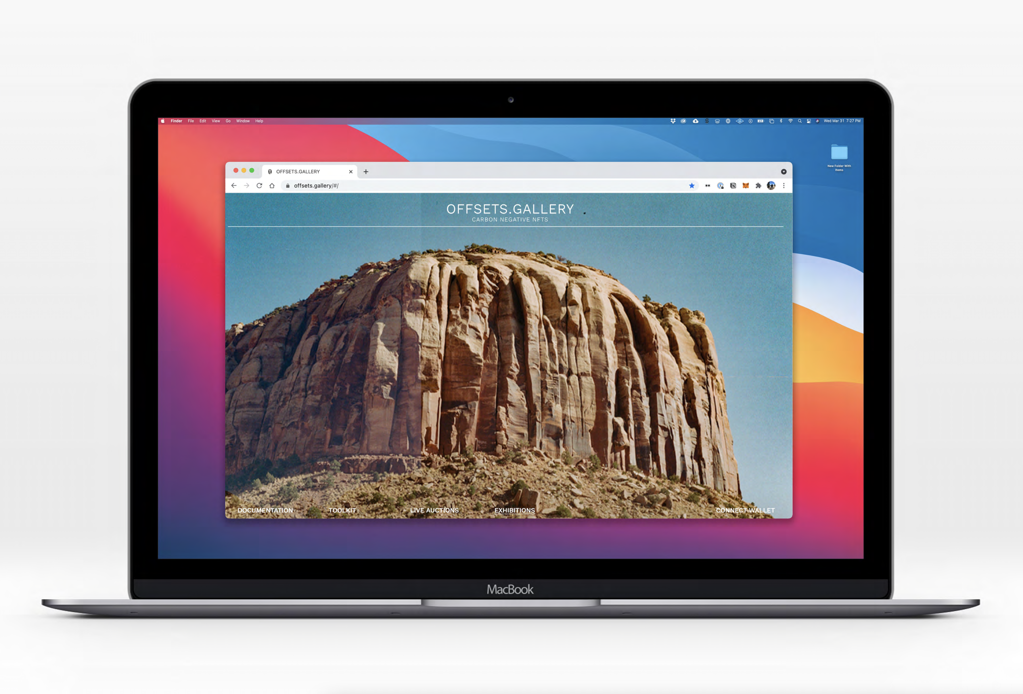
OFFSETS.GALLERY
CARBON NEGATIVE NFTS
BRANDING • ARTWORK • EDITORIAL ILLUSTRATION ︎ FOR OFFSETS.GALLERY
01. 2021 ︎ 01. 2022
In the early months of 2021, the world’s attention briefly drifted away from the covid-19 pandemic toward something that felt much less morbid but at times just as polarizing, NFT’s. Often interpreted by the collective gaze as either a global ponzi-scheme, an era defining economic innovation or just a bunch of idiots buying jpegs you can save for free. One thing was obvious, massive amounts of money were changing hands in new, confusing and possible dubious ways.
For the creative community, the possibility of a new revenue streams in the tens of millions of dollars was pure fantasy one day and published fact the next. However, the silver lining came with one glaring cloud. Namely, that the backbone of this new vanguard relied on industrial level computing power all set on the back of our globe’s already misaligned energy system. In short, for every new dollar made, the climate would write the check.
For the creative community, the possibility of a new revenue streams in the tens of millions of dollars was pure fantasy one day and published fact the next. However, the silver lining came with one glaring cloud. Namely, that the backbone of this new vanguard relied on industrial level computing power all set on the back of our globe’s already misaligned energy system. In short, for every new dollar made, the climate would write the check.
Why then, would any self-respecting, climate-science-believing creative participate in this brash and damaging economy? Let alone found a company. These were the questions I had to answer when I was approached to collaborate on artwork, branding and eventually founding the organization which came to be known as Offsets.Gallery.
In three words: give it away
Creative Direction & Design: Jake Lerman
In three words: give it away
Creative Direction & Design: Jake Lerman

︎ OFFSETS GALLERY
The idea of an online art gallery is not a new one. However, when the concept of a space where one goes to focus attention and ascribe value is applied to larger concerns a whole new world emerges.
Offests gallery was created with one idea in mind, Offsets as many tonnes of carbon emissions as possible by donating a massive oercentage of all profits made by the gallery. In practice that mean 90% of ALL PROFITS are being comitted to carbon capture initialtives across the globe.
Offests gallery was created with one idea in mind, Offsets as many tonnes of carbon emissions as possible by donating a massive oercentage of all profits made by the gallery. In practice that mean 90% of ALL PROFITS are being comitted to carbon capture initialtives across the globe.
Now that we had a worthy mission, and a name conjusing the Carbon Offsetting that we’d be supporting we needed a flad to fly under.
Initials upended provided a clean reference to our brand name while introducing the iconography of a tree and a clock. SHowing our progress, and what’s left incomplete. Simple, strong and as elegant as any coture mark. It set the tone for the work to come.
Initials upended provided a clean reference to our brand name while introducing the iconography of a tree and a clock. SHowing our progress, and what’s left incomplete. Simple, strong and as elegant as any coture mark. It set the tone for the work to come.


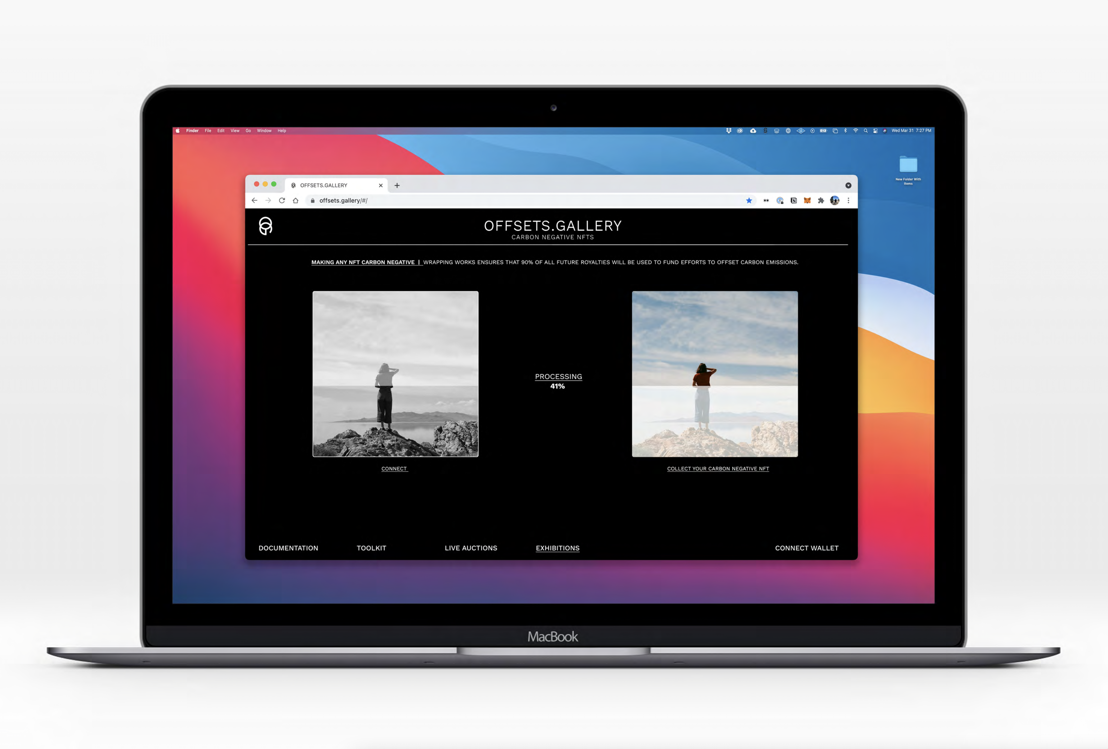
︎ AN ELEGANT AUCTION HOUSE
![]()
![]()
︎ FREEDOM AND EXPRESSION
![]()
![]()
![]()
![]()
![]()
![]()
![]()
![]()
The NFT space is flooded with garish and childline imagery. The auction houses are alternatively fadish experiments in anti-design catered toward Gen-Z adopters or clunky financial industry tropes dressed up in sicilon vallery cliché.
I decided that our gallery would feel as light and invisible as possible. Keeping collectors attention on the works themselves and setting a respectful tone the artists we’d feature deserve.
I decided that our gallery would feel as light and invisible as possible. Keeping collectors attention on the works themselves and setting a respectful tone the artists we’d feature deserve.
Black on white, single sans typography, 1px keylines and as much breathing rooms as possible brought the elegance we needed without drifting too far into stoicism or boredom.
︎ FREEDOM AND EXPRESSION
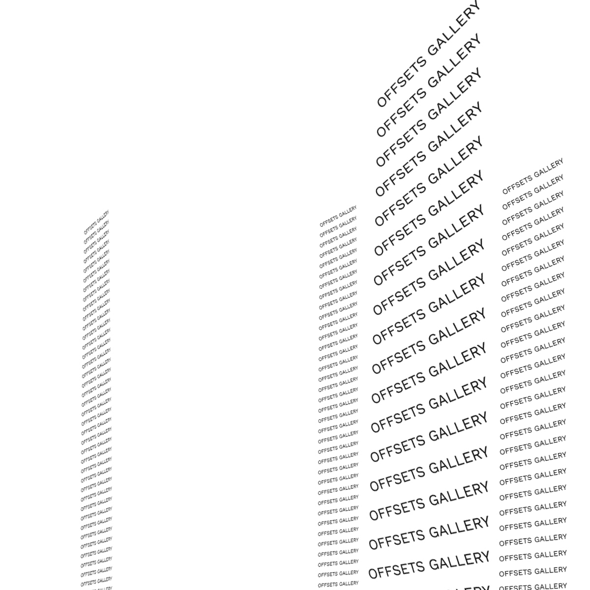
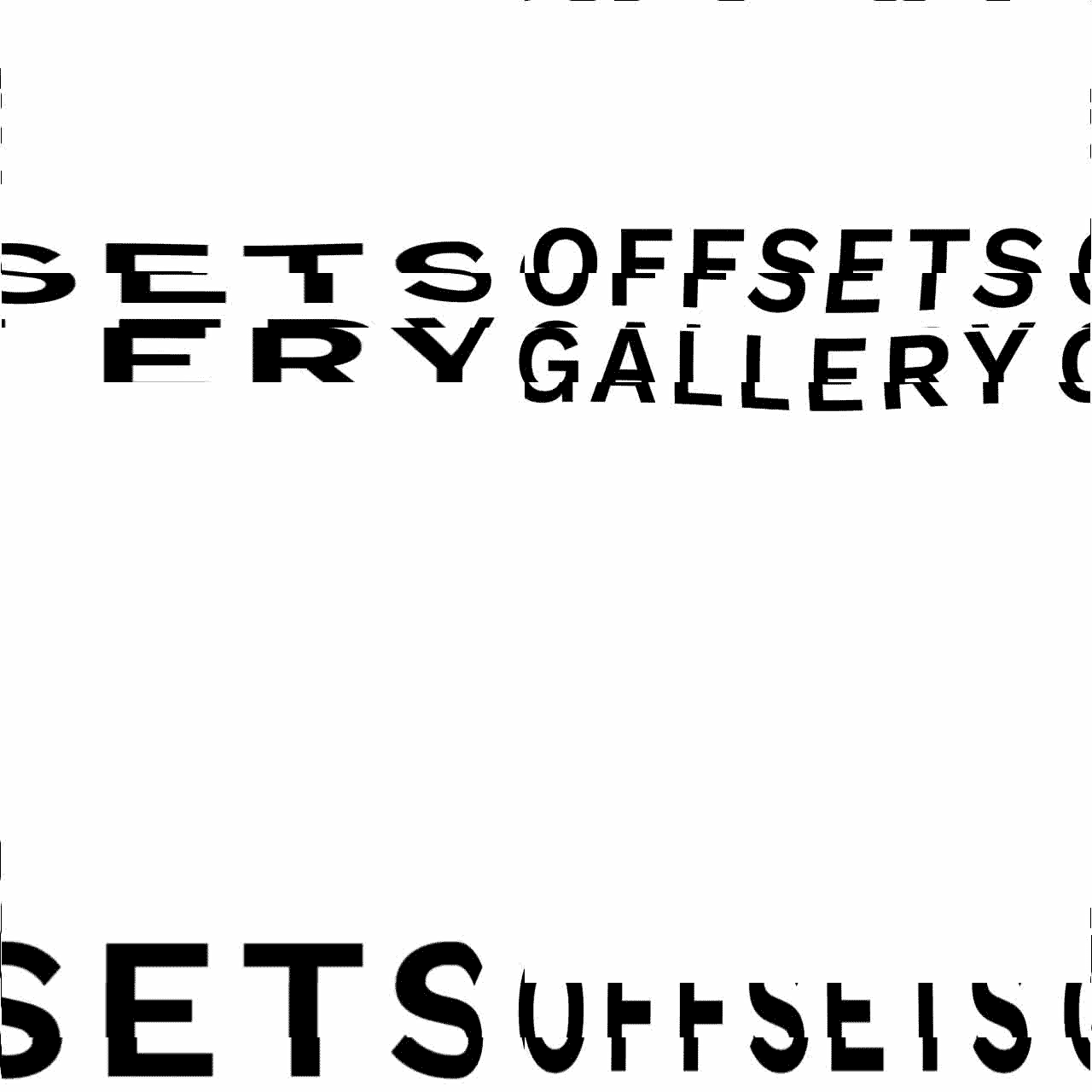
Now that we built the rules it was imporant to begin to break them. Abusing the typography through procedural motion graphic we were able to expand the brand name “Offsets” into a series of promotional pieces that introduced a voice that would carry on throughout our identity.
These looping pieces were created in a node based software system that allows for countless iterations to be produced very rapidly. As we curate more shows we’ll see this visual language expand into new and more dramatic displays.


︎ PAINTING AN INTRODUCTION
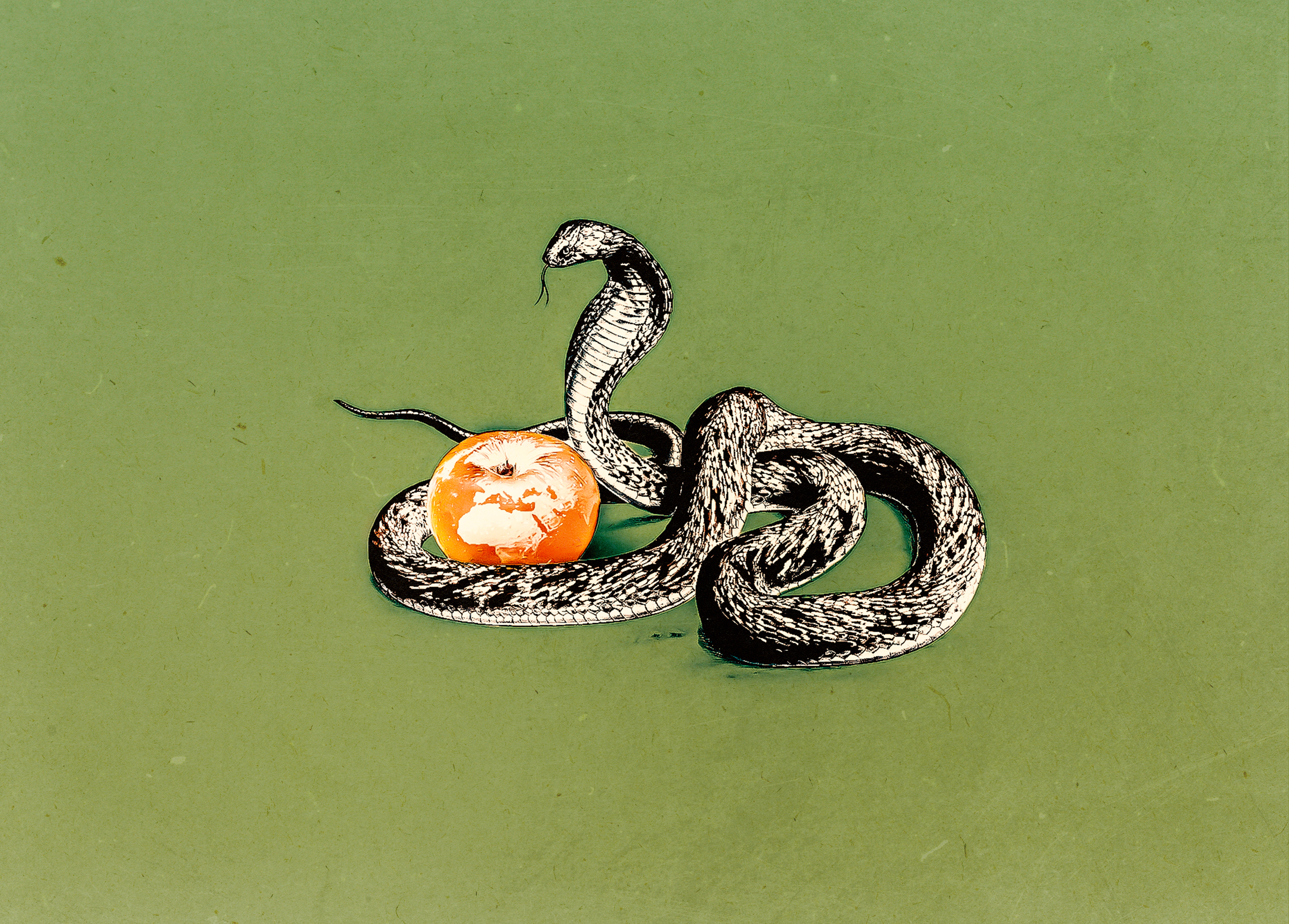
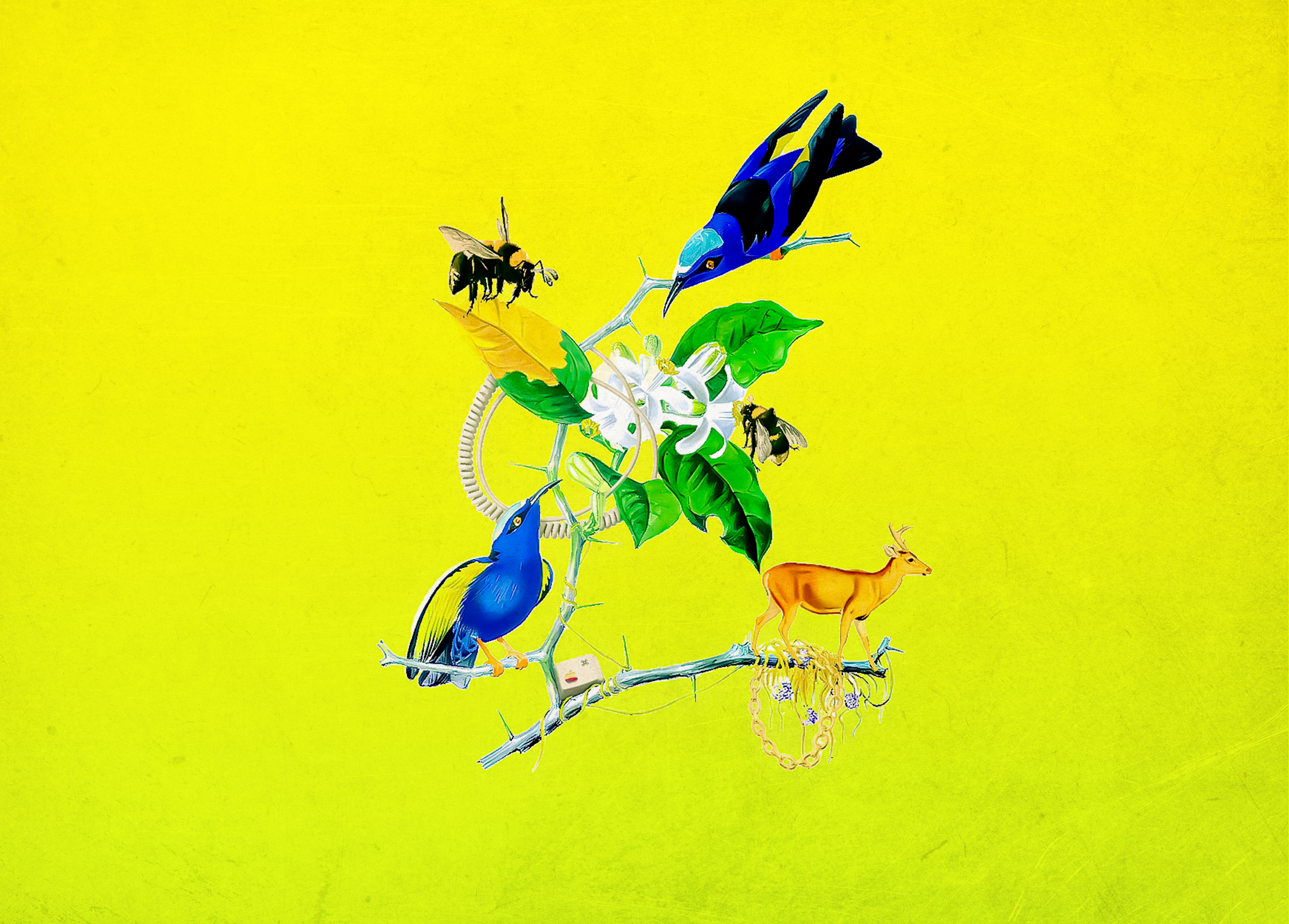
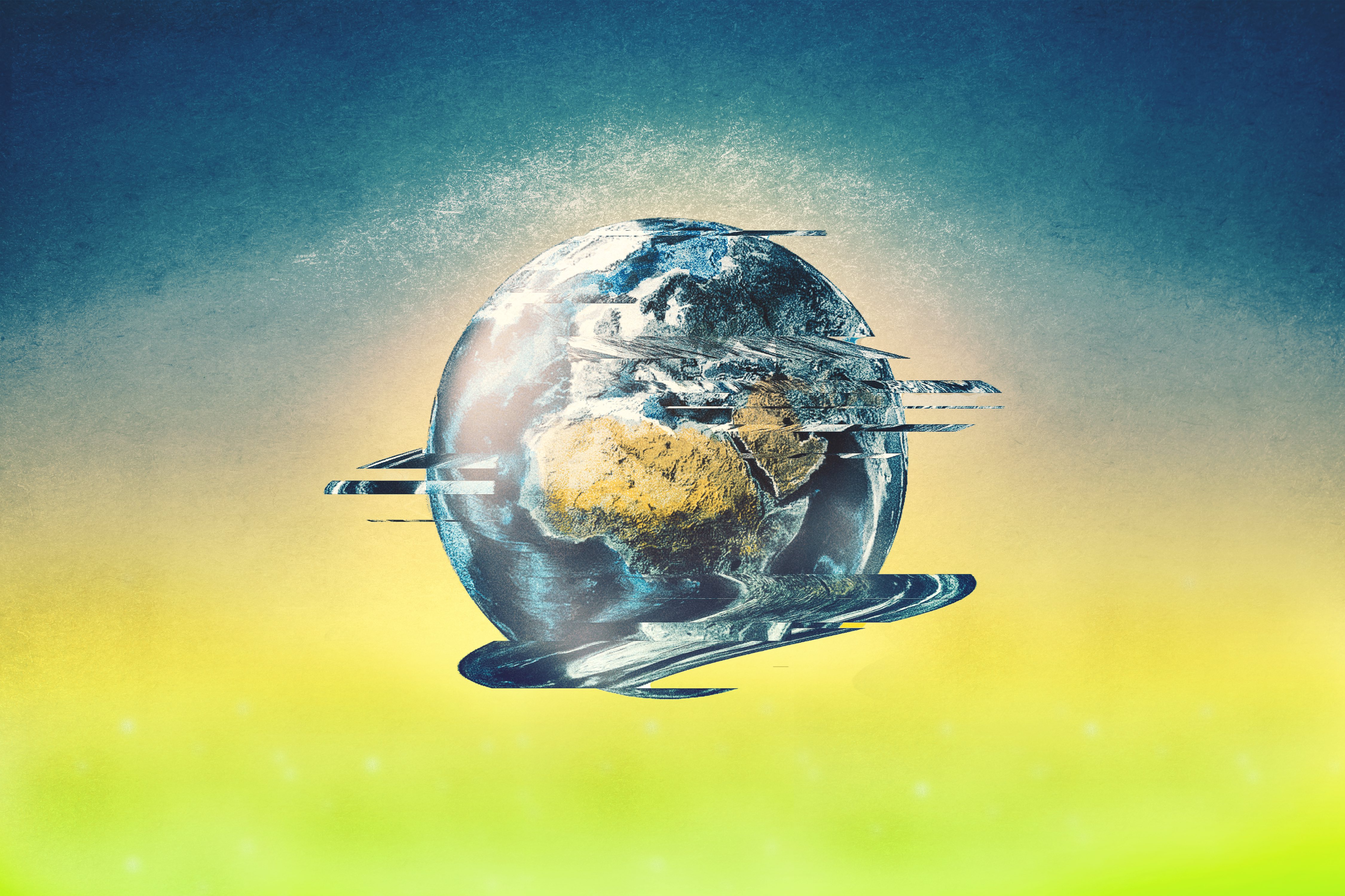
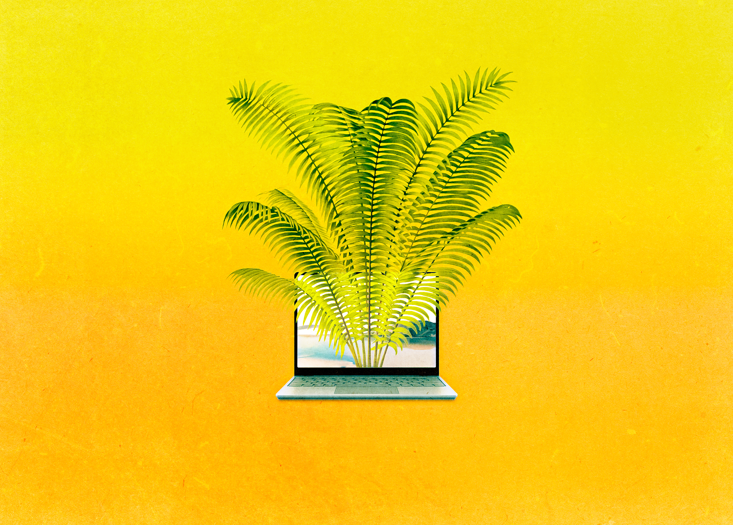
One of the biggest hurdles in the world of NFTs is that so many people hate them. They associate the entire space with the loud-mouthed crypto evangelists and stories of illicit dorm room purchases. In that spirit we felt it crucial to provide a series of articles that help get a curious mind past the tropes and into the exhibitions safely and confidently.
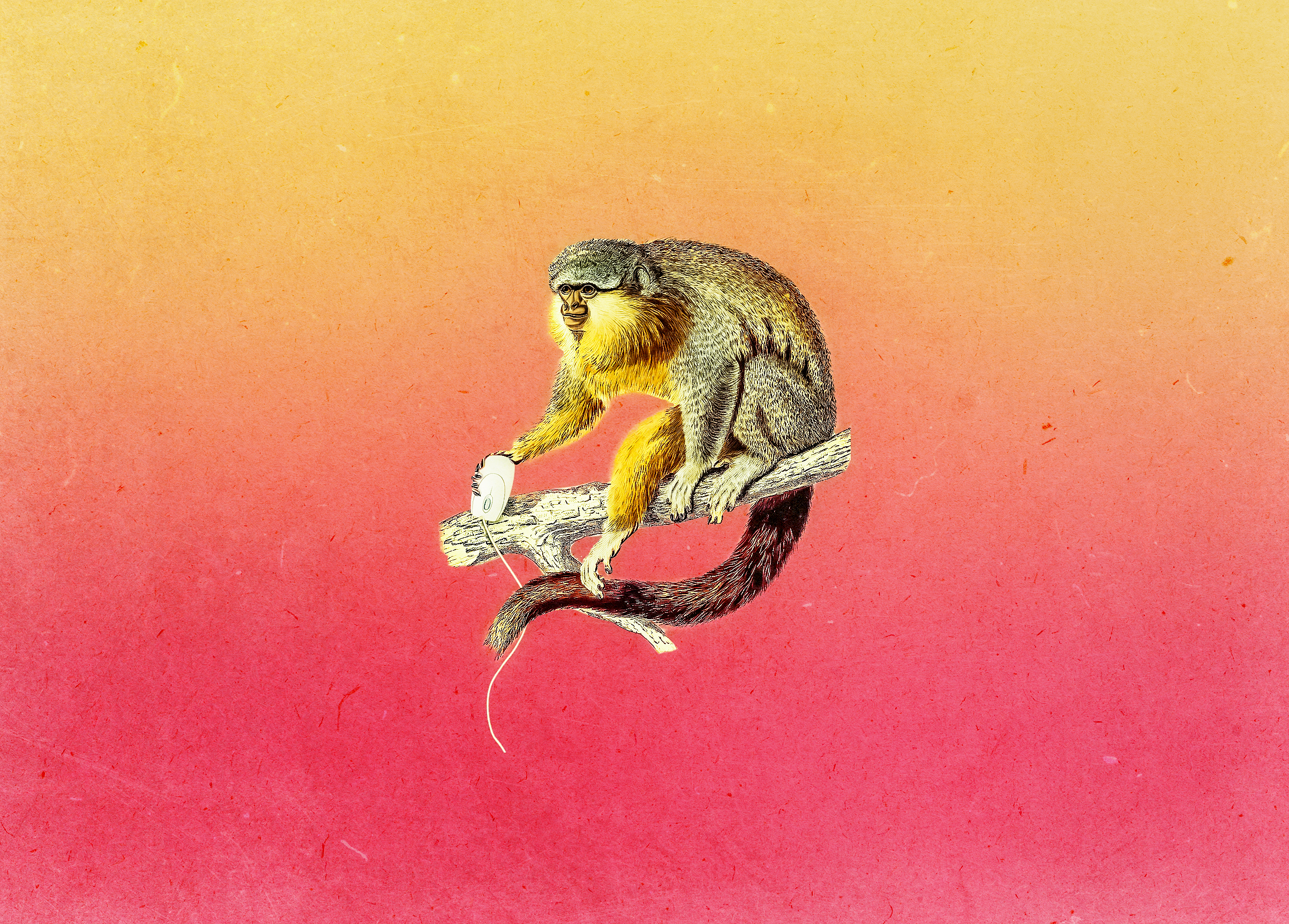
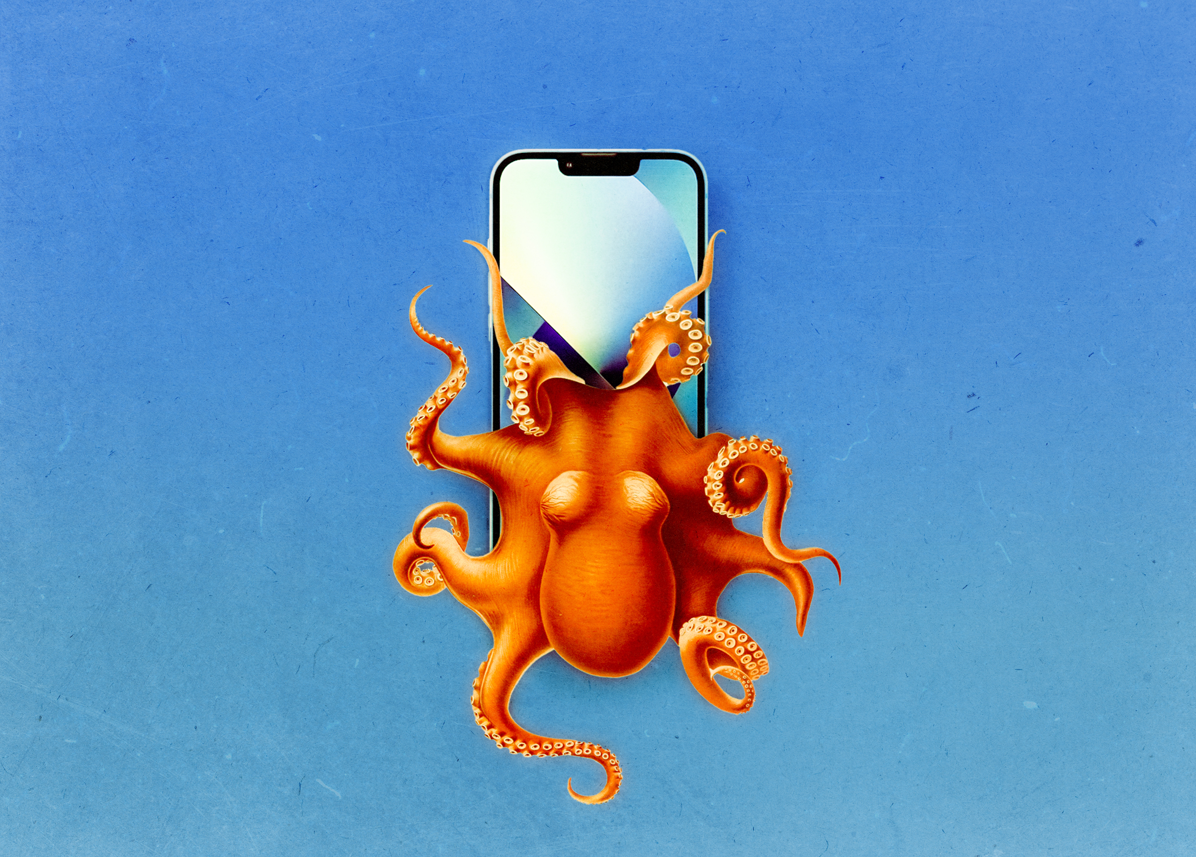
By introducing anthropological illustrations and vibrant colors we created title cards for this series of articles that are welcoming interpretations of the topics we’re covering.


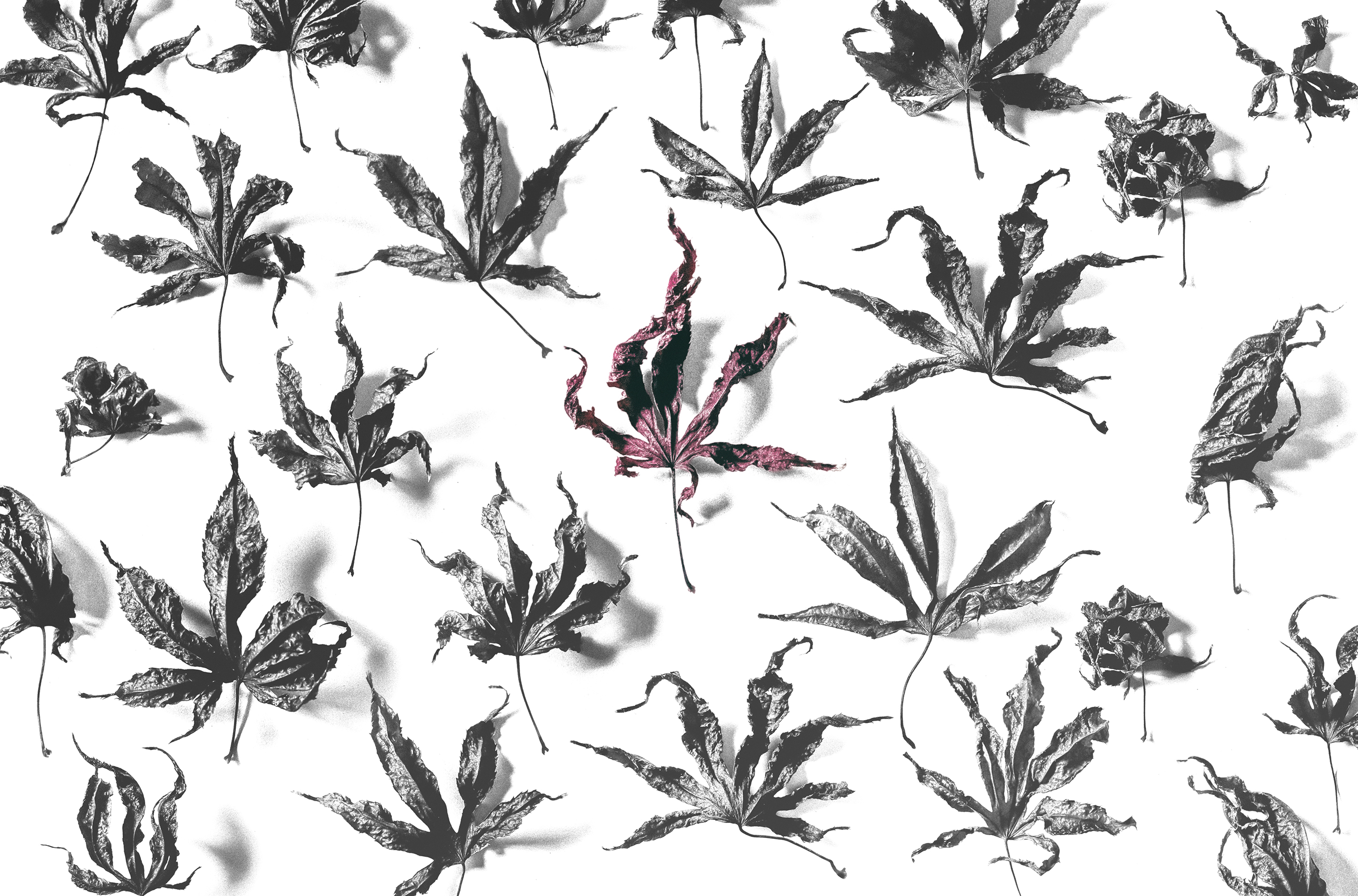
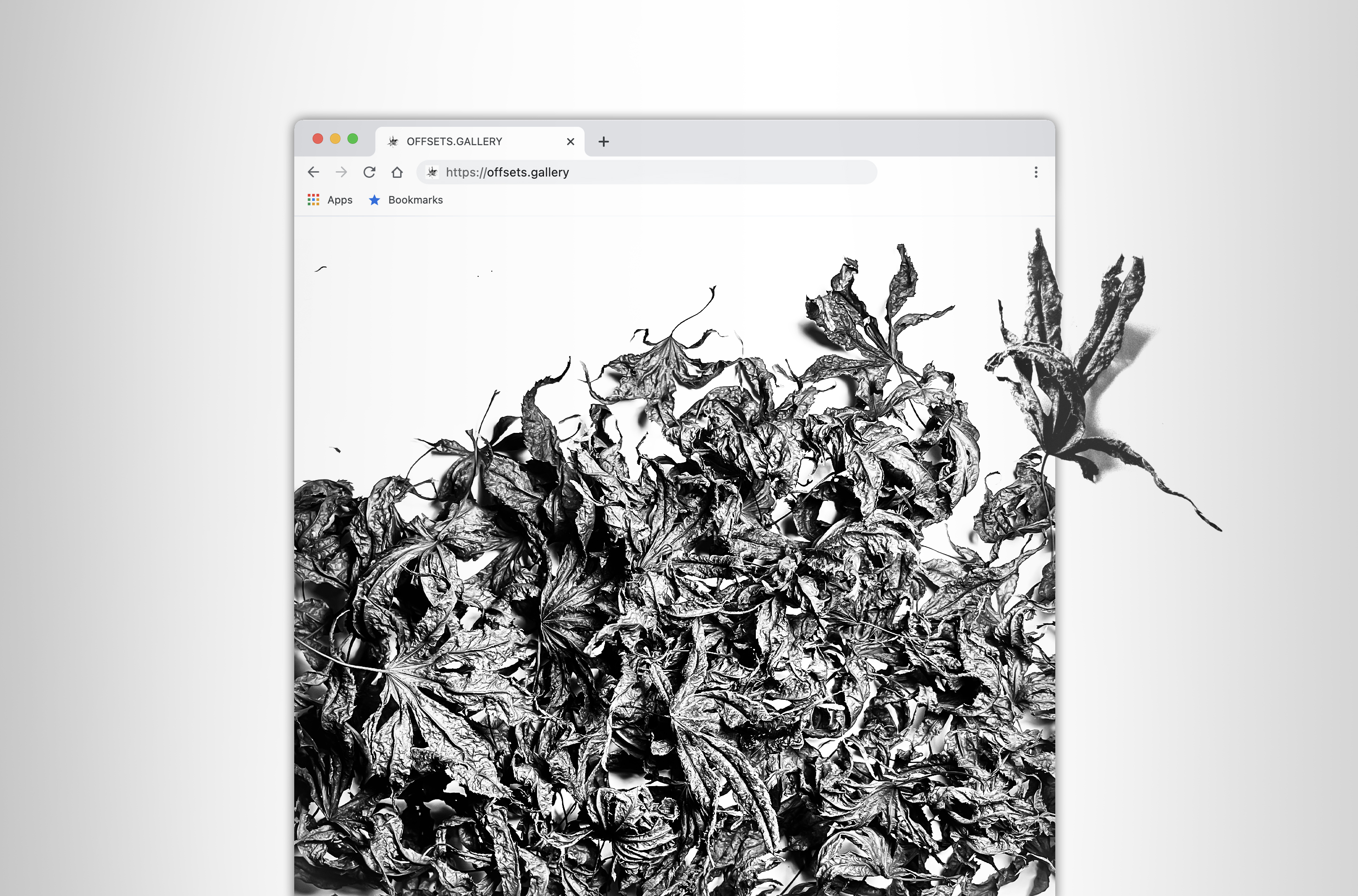
︎ SET NO. 01
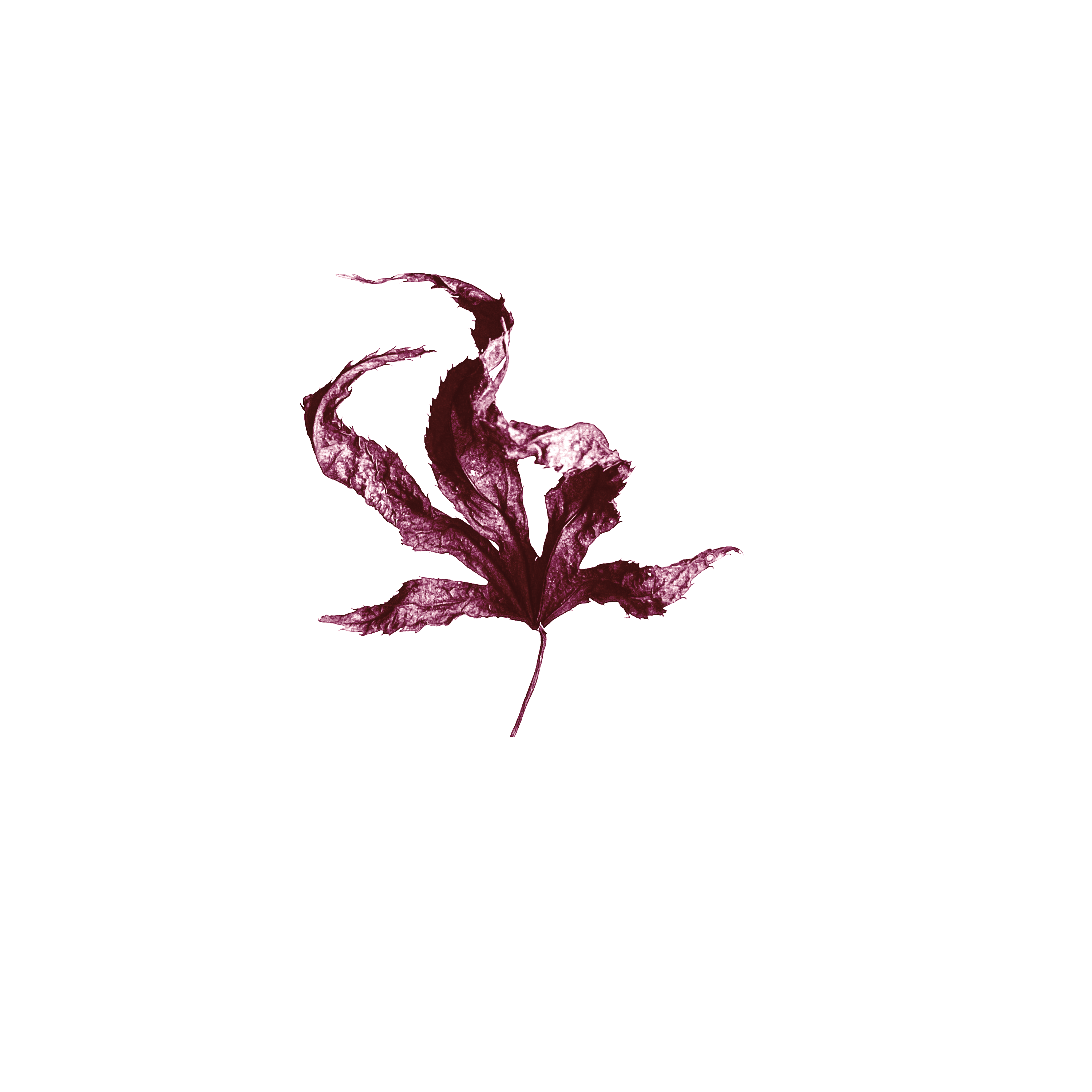
The show that launched it all. Originally meant to be a screen printed series I had been inspired during the pandemic lockdown to focus my attention on my Brooklyn, NY surrounding more clearly that I had been able to while commting to Manhattan each morning. The small Japanese Maple in the front yard was what caught my eye.
By photography each leaf that fell that Autumn I was able to creat a series of focused sculptural images that when set together managed to subvert the overdone culture of “ digital collectibles” that were so present int eh space at the time. These incidental, natural pieces are as common as can be but they developed a tangible worth when we devote our attention and begin to reconsider what it is we value.